Client
Webistes NYC
Branding
A square-shaped logo was designed to give it more stability and the color orange was used, which in color psychology provokes an emotional response of action, energy and fun, along with violet, which is associated with wisdom and sophistication, precisely those ideals that the brand represents.
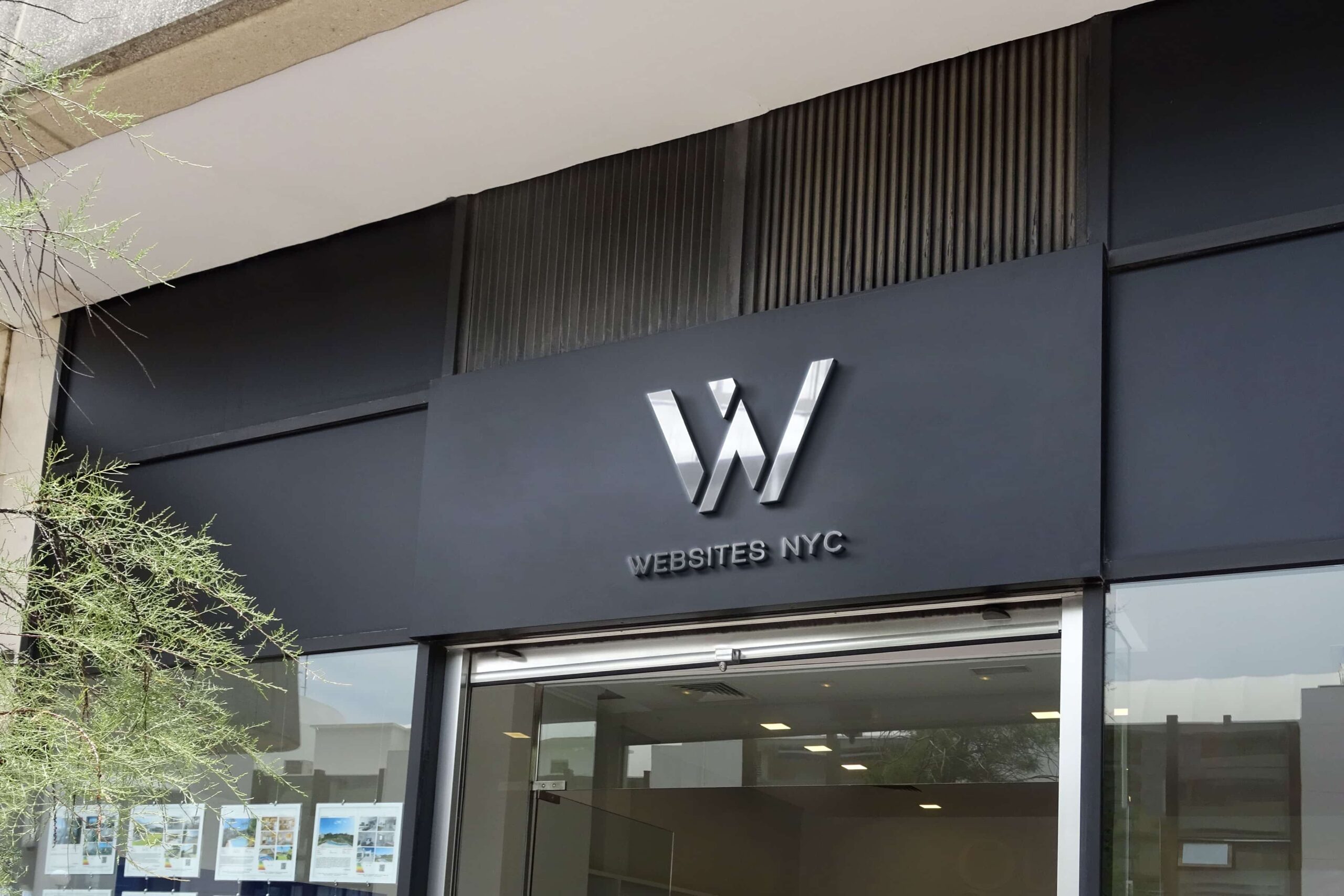
The logo is the combination of the letter W that stands for website with the N that stands for New York and with a three-dimensional touch that gives it depth..
Let’s Create Together
Connect with us to explore how we can make your vision a reality. Join us in shaping the future.